Overtime, editors of the website decide to make micro adjustments on each page they build, thus leading to an inconsistent website.
- Buttons are different sizes, and colors, and styles
- Content layouts are different from page to page
- There is a random stroke of pink on a page that no one knows how it happened
- Images overflow their sections (especially on mobile devices)
But how to you squash this problem? Most of our clients have multiple people editing their websites – all with their unique “creative flair.”
Whether we have built your website or not, there are ways to make the page building process simpler and more consistent.
Core Element Styles
First off, you want to know what each of your core elements should look like. What is a “core element?” Anything that can be typed in plain text.
- Headings
- Paragraphs
- Lists
- Image captions
- Quotes
- Text hyperlinks
- Buttons
Because a lot of CMSs allow for micro-sized adjustments, it is easy for this list of elements to become out of sync with one another.
Establish a rule for all of your editors: do not allow any of these core elements to be adjusted. Use them all as-is and do not make any changes to them page-by-page. This is assuredly a hard rule to follow, and will feel constricting at times, however, it does allow for a simpler building process once editors become comfortable with it.
We also know that one version of each of those core blocks won’t cut it. You need varying buttons styles and sizes for regular text. For each of the elements above, define two sets of variations:
- Sizes: Small, Regular, Large, Extra-Large
- Colors: Default, Primary, and Secondary
Not every variation applies to every core block (ie. text hyperlinks will simply follow whatever font size the paragraph it’s in). But, if you run through these variations for each block, you’ll have no less than 40 unique core blocks at your disposal to build pages.
That’s not too bad.
Create a Block Library
Every CMS calls these something different (patterns, templates, sections, etc). The goal here is to create groupings of blocks that you can re-use multiple times over.
But where should you start? Let’s outline a few key sets of blocks that will help get you started:
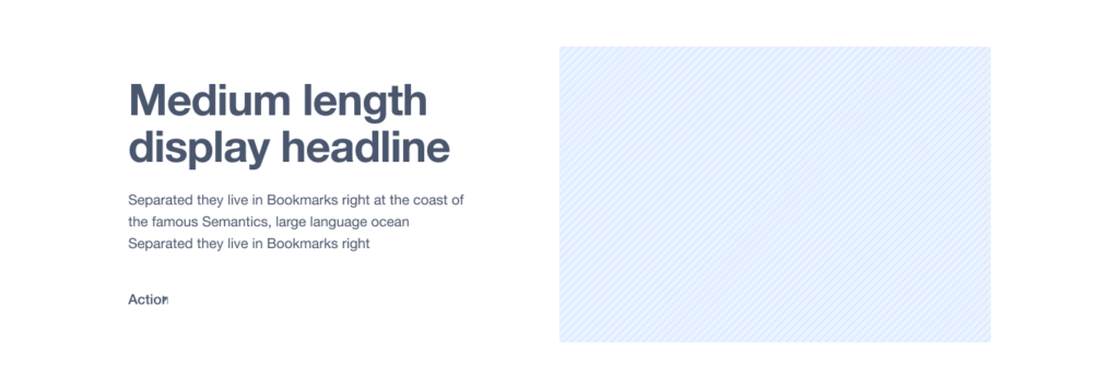
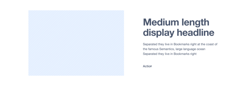
Two Column Layouts
Every website needs to define what the simple “two column” layout approach will be. Build this one, save it away, and then reuse it often.
Calls to Action
There are three default CTA sections every website should have:
Oversized (takes up a lot of the screen)
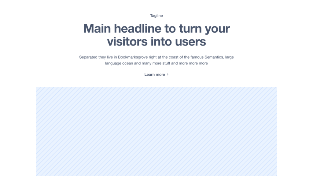
Medium (a good amount of text)

Small (one simple headline and a button)

Testimonials
If you run a business where customers have said nice things (that you’re allowed to publish) having a couple different testimonial styles is key. I typically see having a “single large” testimonial as well as a “row of testimonials” as to solid options to anchor this section of blocks.


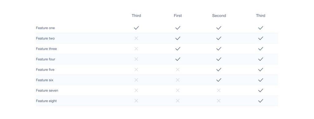
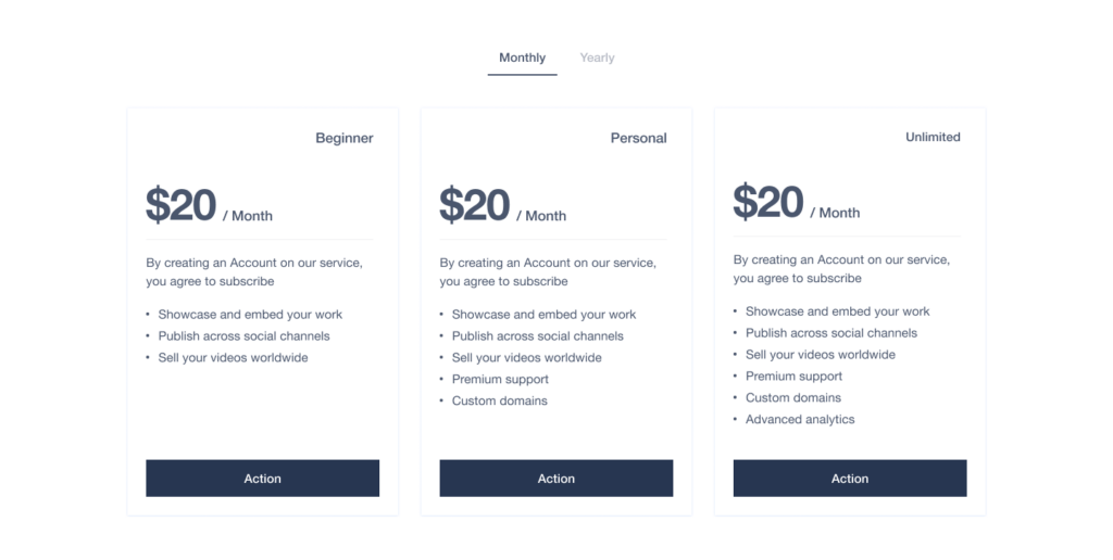
Features and Pricing
If you need blocks like this, once you build them once, you can simply copy/paste them as-is on a multitude of pages (as the information shouldn’t change page-to-page). Don’t do work you don’t have to.
Some CMSs allow you to save a block set as a “template.” That way if you need to make a change, it’ll change it across every location it is used.
Logo Bar
It’s always good to find a way to show immediate expertise. Just like with the Features and Pricing section – once you build this once, you can use the exact same one on other pages as well.

Multi-column with Images
Whether this is used for blog posts, service lines, or industries, having a pre-made block that allows for an image, headline, text, and a button is something almost every page needs to have.

Icon Pods
If your brand has icons, having a multi-column layout that supports your SVG/PNG icons is always a benefit.

If your team were to build out each of the blocks above, you would have 12 building blocks as the foundation for your website. Each of those blocks will simply “just work” since you’ve done the heavy lifting at the beginning.
Build a Guide
Showcase the Block Library
On every site we create, we build a hidden page on the site that showcases every block. We follow a very simple pattern for each block:
- Name of the block
- How to use the block
- A sample of the block
That way, anyone building a new page on the website can visit the “block library” page and know exactly what they are working with before they get started.
Tutorial Videos
You can go one level deeper and for each block (or grouping of similar blocks) you can record screencasts using a tool like Loom to show your team how to use them. New people on the team now have the Block Library to showcase all the options as well as videos to see how other team members use these blocks to build pages.
When we build a website, we embed all of our training videos on the admin panels of the website to allow everyone to have access to them (and also so that “random email from a year ago” never has to be dug up).
You Can Do This!
All of this is feasible no matter what CMS your website was built in. Sure, some will be easier than others, but you can build in consistency to any website. It just takes some planning.

