Almost everyone who comes to us wants to see some of our favorite websites we designed over the years. That is a perfectly logical question.
So, we pull out what we feel are our best examples and talk about them.
We then look at other websites that cover a variety of industries from which to draw new ideas.
Initially, the goal is to design something uniquely theirs (with lots of amazing animations, animated images, and splashes of color). However, at the end of the day, a minimal, simple, straightforward website wins.
Let’s dive deeper into why that ends up happening.
What is the goal?
The goal is always to craft a unique experience for visitors.
A lot of the beautiful, crazy, wow-factor websites end up breaking a lot of rules that website visitors expect. If you haven’t perused Awwwards (a website that awards stunning websites), you’ll quickly notice that many of these sites break plenty of user experience rules. I say not to detract from the skill required to design (and develop) these masterpieces. The talent it requires to pull them off is immense.
Those award-winning websites typically break rules that our clients need to stay in line with. When talking about becoming a rule-breaker, the questions we have to contend with are:
- What rules do you want to break?
- How many rules do you want to break?
- Are you OK with the consequences of breaking those rules?
The risks we took
For example, when writing this, our homepage is long-winded. It has a note from me at the top, lots of words around our process, lots of FAQs to dive into, minimal buttons, and many inline text links. When we built this homepage, our goal was to have a potential client spend time reading through the site, and they would know if they wanted to work with us or not.
The risk we took was a potential client getting bored and not reading through everything.
We are OK with that trade-off because we believe that the web industry is crowded and every web company’s website has the exact same, overly simple information.
Long-term editability
When a website is designed to break many rules, that typically means that development standards are also broken. The time to code out features is longer (and costs more). The ability to edit these unique elements is also a lot more challenging.
When an element has a unique design (or “twist”), chances are that it was designed with a specific set of words and images in mind. Those are probably not effortlessly swapped out.
For example, if you purchase a luxury car, many parts are not as quickly swappable—they are proprietary. You have to go to a specific repair shop that employs specific techs with access to specific parts. If you purchase a more typical car, more repair shops can work on it, and parts can be found more readily.
Before diving into anything unique, we like to ask a few questions:
- Will this unique feature tip potential customers over the edge to make a purchase?
- Are you OK with the potential lack of long-term editability?
- Is having this feature worth the budget that’s being allocated toward it?
There are times when the answer to all those questions will be yes. Or, enough answers will be yes, and it is worth pursuing. We like to run through that test at the beginning to ensure that the budget for your website design is well-spent.
How do we find a middle ground?
This is where art style comes into play.
What is an art style?
These are the small elements that can be used throughout the website to help tie it together. When you’ve navigated a website and have felt that something is different, the small touches of detail typically make it stand out.
Evangel’s sample
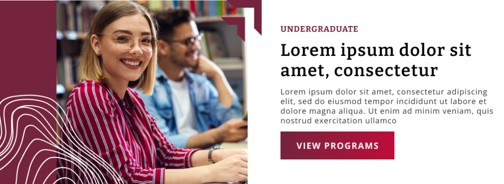
Let’s take a simple two-column layout that is on almost every single website:

Two of Evangel’s elements in their art guide were topography and the “arrows” from their logo. Rather than trying to design something completely custom that would make every two-column layout unique, we designed a style that could easily be applied to any uploaded image.
The goals here were:
- Not requiring a graphic designer to edit every photo
- A style that could fit “on top of” almost any photo
- The content on the non-image side needed to be flexible
This small detail keeps the website’s aesthetic consistent but allows for this common, two-column layout to be used everywhere without feeling tired.
In this format, an image can be uploaded, and the website’s code overlays the maroon bar, the white topographical lines, and the arrows. This is a benefit you get by using a robust CMS (like WordPress) over more drag-n-drop based builders (like Wix and Squarespace).
In Summary
Typically speaking, the goal isn’t to visually stun your customers. At the end of the day, the goal for most organizations is to balance:
- Consistent, beautiful visuals that
- doesn’t require a graphic designer
When this line is found, a website can maintain its usability long into the future, require much less admin work from internal teams, and increase the conversion of potential customers.

