We have amazing customers, great customer stories, fantastic case studies. They’re buried like three, four clicks in, and it drives me nuts.
Common tropes from customers
I hear the above comment on sales calls so many times. Showcasing case studies is challenging (where should you put them?) and they are hard to keep up to date.
Today, I want to tackle the latter: how can we make them simpler to keep up to date?
Today, we’re going to create a simple case study layout that you can use repeatedly. I’ll also summarize the key data you need for each case study so you can reduce the time you spend on each one.
We’re going to go over:
Let’s establish baseline content
Your team should not spend countless hours compiling case studies for your website. When this happens, the most common reason is that there hasn’t been a clearly defined structure for how the case study will be laid out during the web design process. Team members stare at a “blank screen” and don’t know where to start.
Before we dive into the layout, I want to hone in on answers to two questions that, if answered well, will make the rest of the page simple:
What do potential clients want to learn?
Start by going through all of the transcripts of your sales calls and answer these questions:
- What are common questions that are asked?
- What are the pain points people bring up?
- What “deep dive” questions are being asked (you know, the things not every one of your clients would need to know)?
I want to define these because you probably solve similar problems across your clients. While these answers won’t solve every client’s problem, they will keep you focused on what is most important to them.
What do you want potential clients to do?
I see this element missed the most. You (should) be proactively sending clients to individual case study pages as a part of the sales follow-through motions. Those case studies are saved away as unchangeable/untrackable PDF files attached to an email. One of the core benefits of having the information directly on the site is being able to embed actions on the page.
In order to do so, you need to know what action you want that potential customer to take.
Two easy examples to get you thinking would be:
- If you’re using your case study pages well, and they get a lot of organic traffic, perhaps softer CTAs (like newsletter sign-ups or the download of a lead magnet) would be good
- Perhaps a sharper CTA (like scheduling a follow-up meeting) would be more beneficial if you’re primarily driving traffic on a call-by-call basis.
Example
Go ahead and list the answers to the questions above, as well as your potential CTAs. I’ve jotted mine down below.
Common Questions
- Our website is disorganized
- We honestly just need an aesthetic lift
- The marketing team spends too much time editing the site
- The message of our company has shifted, and our website hasn’t kept up
Calls to Action
- Scheduling a call is the most important (as most of the traffic to those pages is intentionally done)
Section-by-section breakdown
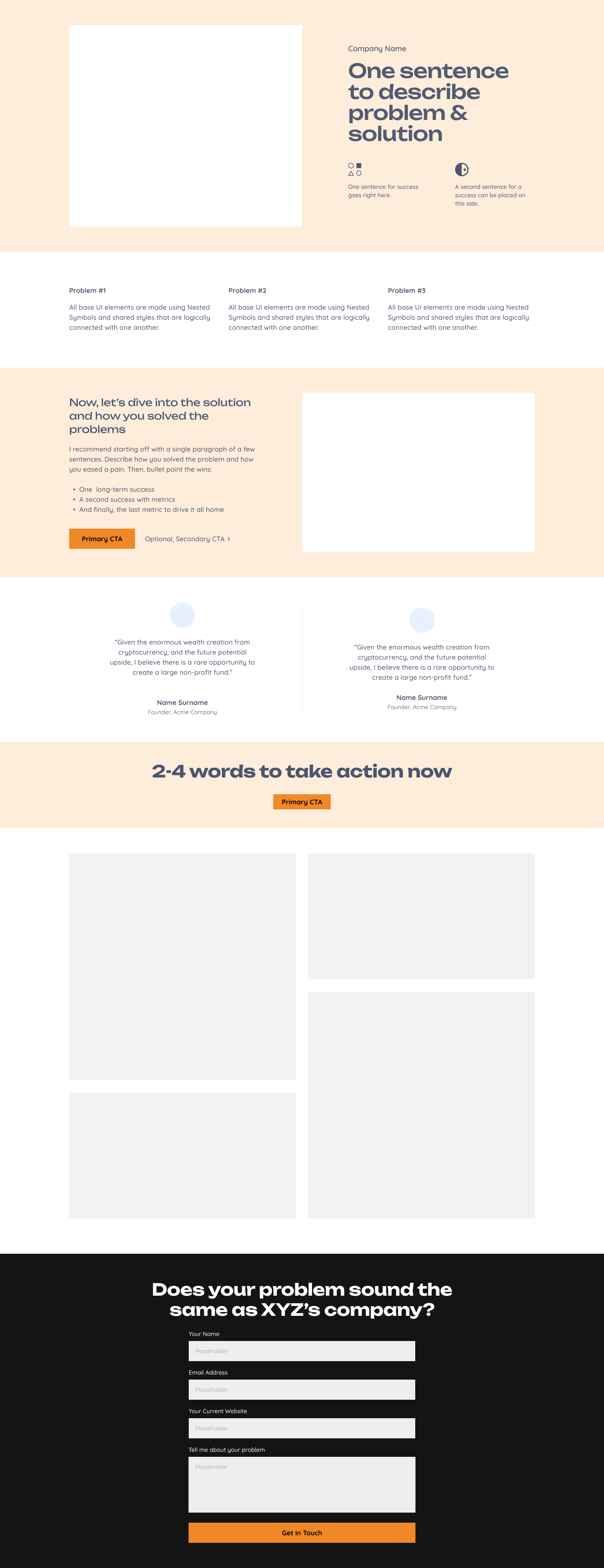
Now that we have our common threads to pull from, let’s dive section-by-section through the layout. (You can jump to the full layout if you’d like).
Hero section

Problem statements

Solution description

Testimonials

Want to take a look at our entire project plan template?
Direct CTA

Gallery (if applicable)

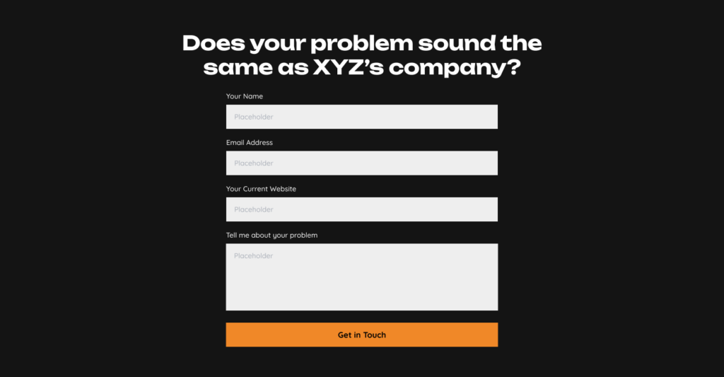
Form for action

Summary of content to collect
Now that we’ve gone through every piece of the layout, let’s drop a quick summary of the data points you’ll need for each case study:
Copy these into your project management system in a “task template” so you have easy access to them every time you complete work for a new client. With these pieces of data in hand, building out a case study page is simply “fill in the blanks.”
I walked through variables on how pricing a website redesign works
Bonus features for your case study page
Full layout to download
You can download the full-resolution PNG. You can also jump back up to the walkthrough.


