With the average website visit lasting only 15-seconds, it’s important to be smart with your homepage real estate. There are a few tweaks and changes that can be changed in order to ensure you are putting your best foot forward and keeping people on your site long enough to take the next action in the process of getting to know you and your business.
Tell them who you are and what you do
Before you move forward in trying to sell or educate, being clear in what you do is critical. The first thing someone should see, is your business’s definition.
Before scrolling down, include a statement that briefly and accurately describes your business
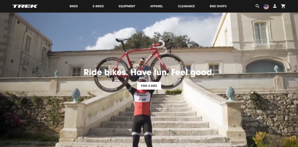
Look at the homepage for TREK bikes.

You’ll notice that there are rotating images of people on their many types of bikes, but more importantly, you’ll see the tag line “Ride bikes. Have fun. Feel good.” and then a very clear call to action “FIND A BIKE”. You know exactly what you are expected to do on their homepage, find a bike that you can ride so that you can enjoy your life in spandex shorts having fun and feeling good.
While an ambiguous headline can make someone dig deeper into your site, it could also increase your bounce rate if they don’t want to take the time to piece together what you do.
A great headline will answer the key question
What do you do?
In this example, it’s very clear: They sell bikes and you should buy one.
Compelling imagery
I would like to take this opportunity to be very open and honest about stock photos.
- Yes, we use them.
- Yes, they save time.
- No, we don’t think they should be used on your homepage.
Your business in unique and, while stock photos are great on interior pages, your homepage should really distinguish you from your competition with custom imagery. Whether your industry is business-to-business or business-to-consumer, the relationship is always human-to-human.
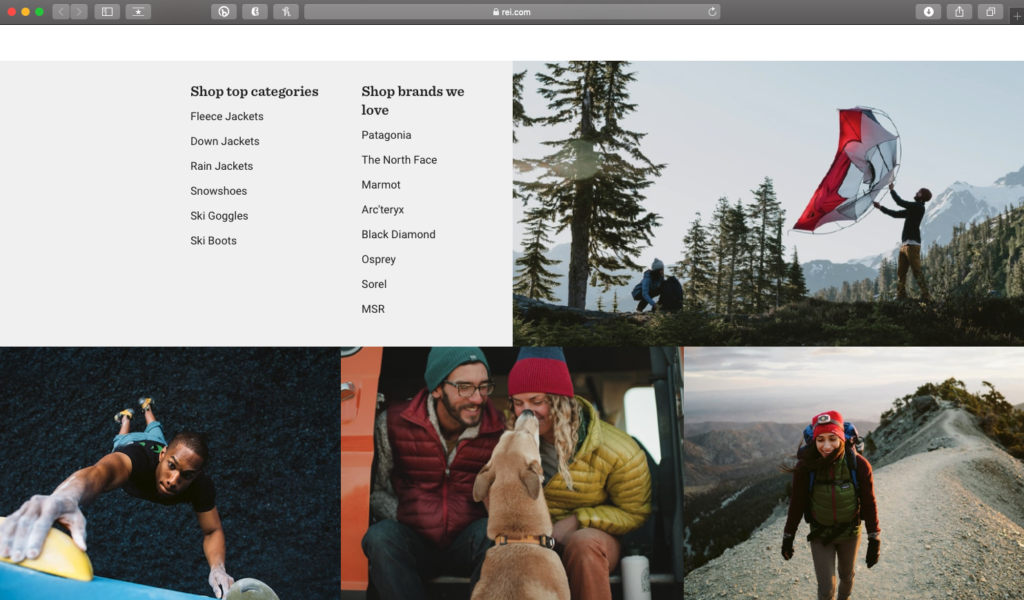
Now you may enjoy camping or you don’t, but after viewing the images on the REI homepage you want the experience that these people are having.

When the images that you put on your website reflect the aspirational view of your visitors people will want to be a part of your brand. Project the happiness that a customer will feel after engaging with your brand. If after viewing your website they want to go buy a tent, pack up their dog, and take their Subaru to the mountains then you are winning — this is assuming you sell either tents, dogs, or Subarus.
Identifiable calls-to-action
Now that you’ve explained who you are and what you do and shown how happy people are after engaging in your brand, you need to show what the next steps are.
This is a great chance to use a tech superstar and advertising Goliath as an example.
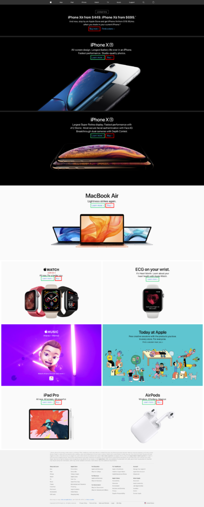
Apple has two primary actions for their users: “Learn More” and “Buy”.

Apple offers twenty-seven products in more than 200 versions. Apple has also sold about 2 billion devices since the 2018 keynote event in September. Yes, their marketing is brilliant, but it’s a case when keeping it simple works. By not overwhelming people with all the options, it makes the showcased items easily digestible.
Conclusion
In the fifteen second window, you want people to take a look at your homepage and know that you can solve your problems. Presenting a compelling message with unique imagery and clear calls to action will encourage people to view your brand different from others out there and you will stand out amongst all the noise. Your homepage is how you make a great first impression.


