Calls-to-action (or CTAs for short) are useful tools for creating engaging websites. In order to understand how to place them properly to get the most effective results, we first need to answer the obvious question…
What is a CTA?
A call to action is a defined area of your site that prompts a user to take a desired action. This can take on a couple of different looks. It can be sections of content with a header, a few sentences, and a button to take the action or simply just a button. Whenever a website visitor is pushed towards an outcome, it is a call to action. Structuring your website around your calls to action will make it work effectively for you.
Using Calls to Action
In content-first design, your design and layout are developed around
- Your target customers
- The reason they are visiting your site
- The actions that they will take on your site
- Your business’ purpose
- Your story
You want to make sure your website is laid out in a way that will solve a customer’s common problems and have them take a desired action, whether that be sign up for an email list or buy a product. This is where CTAs come in.
This is an example from our website.
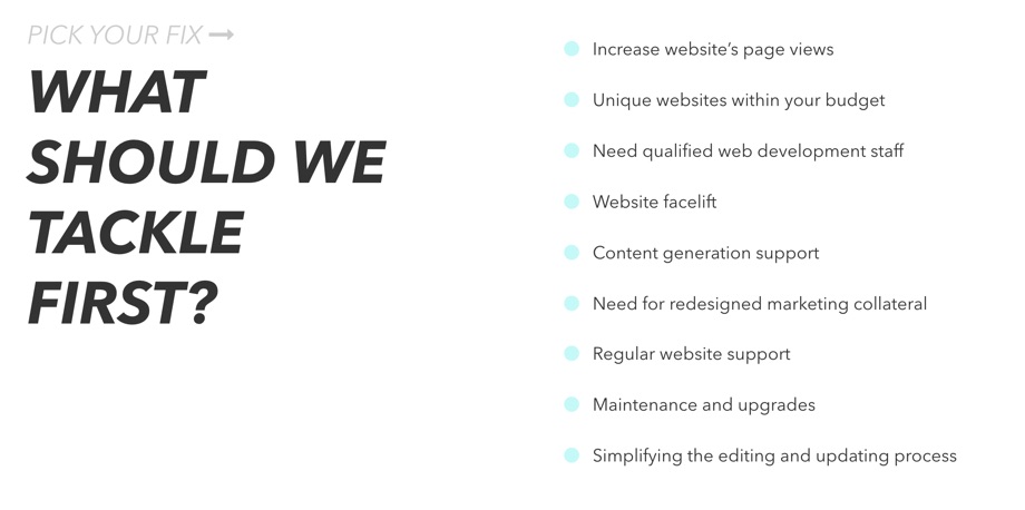
On the homepage, we took common problems customers have and linked those to areas on our site that shows how we solved that issue for other clients. At the end of each section, there is a button that allows them to get in touch with us about that specific service area.
Where Should I Put CTAs?
There isn’t one master plan that dictates where you should put calls to action, but there are a few guidelines that work universally.
Above the Fold
You want to make sure you have a single, prominent CTA that is seen before scrolling. This CTA should define the single problem that the majority of your site’s visitors will be having along with a clear solution in your action text. To be effective, analyze why your customers landed on your site in the first place. Understanding that will allow you to craft a sticky call to action on your homepage.
In Your Footer
Make it easy for customers to get in touch with you by providing a CTA within your footer. Not everyone will make it to the footer of a website, but your footer should summarize your business and provide easy links to key areas of interest across your site. Use this real estate to leave a lasting impression on visitors and give them a way to contact you with any unanswered questions
Strategically Within Content
Everything you write about your business provides a reason to work with you! All of your content from the “About Us” page to your blog gives you the opportunity to invite engagement. Depending on the content and the types of CTAs, you can have one or multiple within a single page.
Here’s an example of a post on Mashable where they invite you to read other articles on the site.

They inject a text link into the article that is connected to the topic you are currently reading. It is helpful to the reader and doesn’t draw any unnecessary attention away from what you were already focused on, and now Mashable kept you on their website engaging with their content longer.
A pop-up ad can be effective, but in your face CTAs can cause a bad user experience.
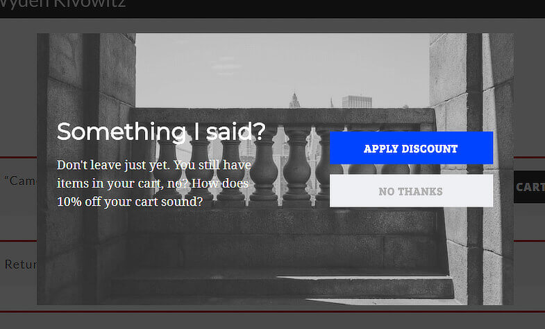
This is an example of a pop up box that shows up when your cursor moves toward the “close” button in your browser. This obvious CTA is the company’s last effort to keep you on their site, collect information about you, and engage with you some way. For the right type of person, this may work, but it is usually considered bad form.
Are my CTAs working?
The best way to find out is by installing heat map tracking on your landing page. To gauge the success of a call to action, knowing that the customer has seen the item is key. If a page has zero clickthroughs, you might assume that the content doesn’t resonate with visitors. However, what if no one ever saw the CTA that redirects to the page? That’s a critical piece of information needed judge a CTA effectiveness
Scrollmap

A scrollmap shows us how many people scrolled down to which parts of a webpage. From the scrollmap above, we can see that almost everyone views the header section of this landing page. As we move down, only 50% of total visitors even scrolled this far to read the content. Even further, only 25% got to the blog posts in the footer are being seen.
This gives us actionable data. We know that we are getting pretty much 100% viewership on our hero image. But, the section right below the fold drops down to about 60 percent. Knowing this, we will structure tests to decide how best to increase viewership of our CTAs. A couple of ideas to try would be:
- Shrinking the banner’s vertical height some to expose more content that will invite visitors to scroll further.
- Moving our solutions CTAs further up on the page, right below the header, to drive people to specific pages relative to the problems they are having.
Heatmap / Click Map
Now that we know where people are scrolling to, and what content segments are being viewed, it’s time to take a look at what elements users are interacting with. The heatmap and click map (also termed “confetti map”) show us exactly where visitors have clicked. This isn’t a generalization. It shows us the cursor position when someone clicked their mouse on the website.

We see that a lot of people have clicked on our menu icon. Unfortunately, we can see that our main calls to action aren’t being clicked on as much as we want. By combining the data from both the heat maps and the click map we can see how often areas of the site are being used relative to how many people are actually viewing them. Only by interpreting the data can we make logical decisions on how to structure the pages on our website to best fit our customer’s needs.
We Don’t Know What Our Customers Want
Identifying what someone will be looking for on the landing page is what makes the CTA most effective. If they are getting to your CTAs but not clicking through, there are a few tests that you can do to quickly identify the solution.
A/B Testing
In an A/B test, different versions of similar content is presented to customers, and their responses are measured. Doing this type of split testing is most effective when you only change one piece of data per test. If you change too many pieces, you won’t know what made the difference, and you may attribute success to the wrong update. The example below is from ‘Merica Clothing.
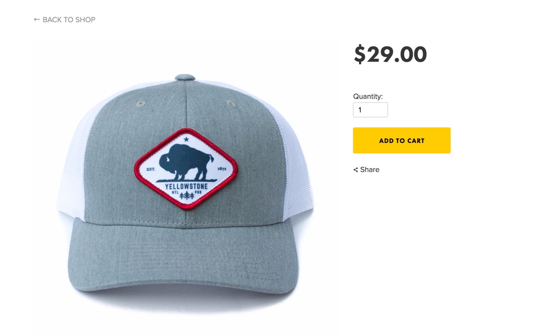
In this example, they changed two characteristics of the CTA button. First, the color was made softer and less aggressive. Second, the text was made to excite action by capitalizing “ADD TO CART”. Now this page converts 50% better than it did before, but the reason for it is unclear
Color (and Style) Matter!
Color is a powerful tool: red excites, blues calm, and yellow energizes. Since you can influence emotion with color, combining it with consistent styling gives your customers a cohesive experience throughout your website. If you lack consistency, you’ll lose your audience’s attention.
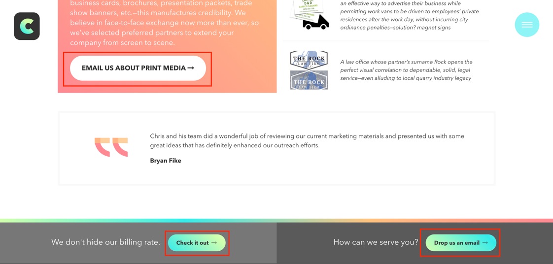
Almost all the buttons on the Classic City website are completely rounded, are set in bold text, and have gradient backgrounds. The button’s coloration matches that of the page it’s on. Our CTAs are not always the same color, but they are styled in the same way throughout the site.
Without CTAs, a website is just an electronic brochure. They turn your website into a platform that not only represents your company, but invites the customer to engage with you. This is a broad and diverse topic that can be applied in creative ways. Have Classic City look over your website and help you make the most out of CTAs.

