
There are some beautiful websites out there – and yours very well could be one of those. It is an immersive, engaging experience, pleasing to the eye and formatted well across different types of devices. Your developer tossed around terms like “UI” and “UX” during the design process for you to think more critically about your brand new website. Now that it’s live, customers should be buying even more of your products, right? You should be closing a lot of new deals, right?
User Experience (UX) is what makes a site easy to use.
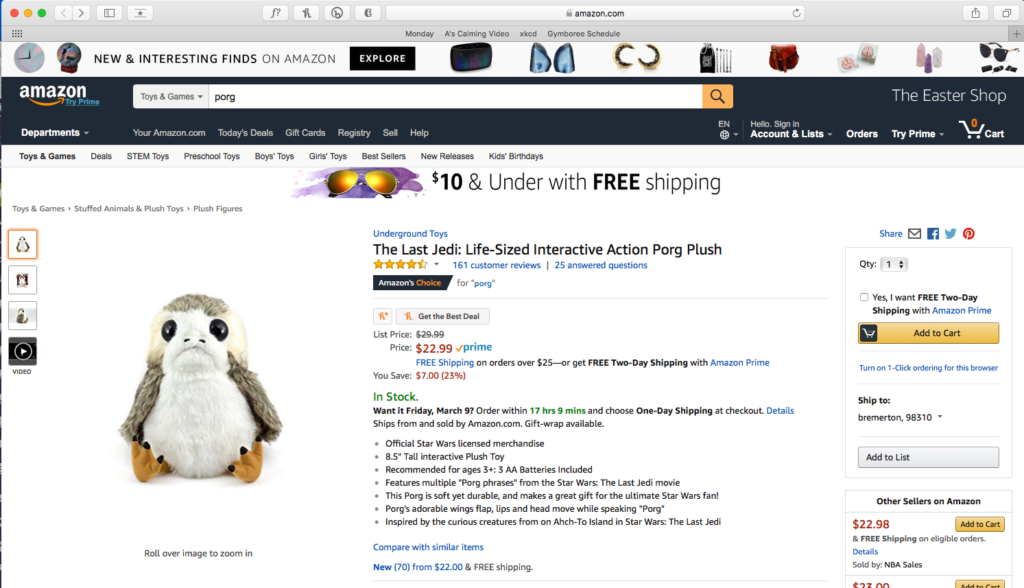
User experience is the ability for a user or customer to be able to complete their intended action with ease and efficiency. Users expect a site to function in a particular manner. For example, when you head over to Amazon.com, you expect to be able to find items, add them to your cart, then checkout. If that three-step process wasn’t simple, Amazon would lose customers en mass. It’s the similarity between checkout on Amazon, Walmart, or Target that makes each site easy to use.
You have to lay out your site in a familiar structure that provides a clear path to all your customer’s end goals. Brand-consciousness can be communicated with styling (like font choice or color palette) to ensure people know it’s your business and not someone else’s. But the process of purchasing a product is the same everywhere: search, add, pay.
Customers buy the same product for different reasons.
But, the issue here lies in the fact you have different types of customers that might take different routes to buy products. How on earth do you sell the same product to completely different people with varying needs and motivations? Can’t you just point people to your global Shop page and call it a day? No. People don’t want to to search to find the one thing they want – they want you to anticipate what they want.
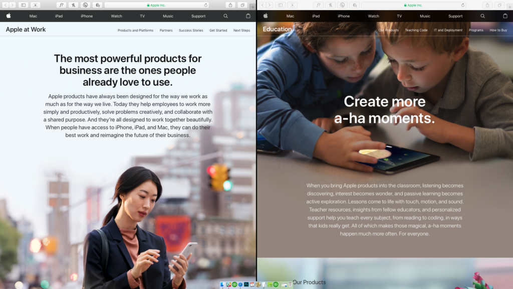
Apple is a perfect example of this. As we all know, Apple sells lots of different products: laptops, desktops, phones, earbuds, tablets and much more. However, my needs as a business owner versus the needs of an elementary teacher are very different. If we’re shopping for a computer, both the teacher and I might buy the exact same laptop model, but how we made the choice to spend our money is not the same.
Landing pages show your customer you anticipated their needs.
Apple has created two completely different landing pages for Business and Education. They are selling the same products but are talking about them differently. Separate landing pages address separate audiences. They are tailored to show off different aspects of the product that might be important from different perspective. In this case, they are talking to two different verticals of consumers, Business and Education. They have simultaneously expanded their audience and made each niche feel welcome.
You can do this too. First, define your main customers – boil it down to the basics: age, gender, occupation, and location. Figure out why these “buckets” of people visit your website and want to purchase. Record how each type of customer walks through the sales process and, voila! Now, convert that buying journey into a landing page. Good design will lead the targeted customer “bucket” to make the purchase.
Successful design is tailored to the consumer, not the company.
Success boils down to content and process. You have to know how your users (i.e. customers) think. Know their motivations and objections. Know the steps that contribute to their buying decision (process), and provide the right info to overcome their objections (content).
If you do the hard work to learn your consumers, then your site can use layout design, text, and images (i.e. UX) to successfully land sales. The goal is to make a crystal clear path of the actions for your user. If it’s filling out a contact form, don’t bury it at the bottom of the page. If you want people to call you, make sure your phone number is in a high-visibility place. (As a bonus, get a special phone number so you know who is calling from the website versus who is calling from your business card). If you want people to buy a product, collect all the relevant details into a single view.
The term User Experience says it all: created by you, for the customer, with clear design to compel action.
[ccc_inline_callout title=”Want a free UX evaluation of up to 5 pages of your site?” content=”Connect with us today to let us know how we can help you discover your client buckets and create landing pages with meaning.”]