Elements
Call to Action
This is a completely custom block. There is a custom post type (hiding underneath the Posts dropdown menu) called CTA. Write out the fields in ACF. Then, drag the Call to Action block on a page and select the post you want to use.
Our Deliverable
Your Audit Document
I wanted to give you a quick glimpse into the audit document our team has been preparing. We have 50+ questions we want to go over with you and your vendors to ensure you know what your systems are capable of and can therefore make wise decisions on the order in which you should tackle your three primary areas in 2023.

Card Text
Custom block. This is a repeater block that allows you to populate cards with text and a button on them.
Sub-header
Header
I wanted to give you a quick glimpse into the audit document our team has been preparing. We have 50+ questions we want to go over with you and your vendors to ensure you know what your systems are capable of and can therefore make wise decisions on the order in which you should tackle your three primary areas in 2023.
Container with Overlap
This is a custom block that allows you to drag other blocks inside of it. The content will always be “contained” inside of it, even though the color background spans the full-width. You can choose a color as well as a position (top or bottom). Please keep in mind what content you place at the top/bottom. Whatever block is “hanging” should have a solid color background to ensure legability.
Here is a header
Lorem ipsum dolor sit amet, consectetur adipiscing elit. Aenean ac feugiat ante. Nullam blandit sagittis massa ac maximus. Curabitur massa nisi, laoreet ut molestie in, ullamcorper ac augue. Mauris non elit nisl. Nulla eu risus augue. Ut euismod elit augue, sit amet sagittis leo tincidunt sed. Proin commodo sit amet libero sed ultricies. Aenean eget tempus lacus, non pretium sem.
Cras in feugiat ex. Morbi efficitur nisi non quam placerat, sit amet auctor turpis ultricies. Suspendisse et lorem ut eros facilisis hendrerit ac eget elit. Sed facilisis sem non interdum malesuada. Morbi eget odio tincidunt, placerat lectus vitae, porttitor urna. Suspendisse non dapibus nisi. Praesent sodales nisl quis urna porta molestie. Aliquam nunc quam, malesuada vitae nisi nec, varius ultrices purus. Integer lacinia, arcu non sollicitudin molestie, metus enim fringilla tellus, rutrum maximus lectus felis non ex. Praesent posuere condimentum urna, vitae viverra augue viverra quis. Phasellus aliquam dui odio, id posuere risus ultrices molestie. Nam eget dui vel orci cursus pharetra sed sit amet lectus. Aenean viverra ultricies quam in sagittis. Maecenas consequat ante non mauris tincidunt, at convallis neque vulputate.
Our Deliverable
Your Audit Document
I wanted to give you a quick glimpse into the audit document our team has been preparing. We have 50+ questions we want to go over with you and your vendors to ensure you know what your systems are capable of and can therefore make wise decisions on the order in which you should tackle your three primary areas in 2023.

Fifty Fifty Block
Custom block that allows you to drag Gutenberg blocks inside of it. You have two default options:
- Arrangement: Left or Right (which side the image is on
- Image: Upload the image you would like to be on the side
You can then place content on the opposite side. Make sure you upload an image that is the appropriate ratio. This block should be used with the Full Width setting, however, the backend of Gutenberg doesn’t like some of the spacing. I’d recommend editing it in Normal width, and when done, making it Full Width.

Sub-title
Title of Section
Lorem ipsum dolor sit amet, consectetur adipiscing elit. Aenean ac feugiat ante. Nullam blandit sagittis massa ac maximus. Curabitur massa nisi, laoreet ut molestie in, ullamcorper ac augue. Mauris non elit nisl. Nulla eu risus augue. Ut euismod elit augue, sit amet sagittis leo tincidunt sed. Proin commodo sit amet libero sed ultricies. Aenean eget tempus lacus, non pretium sem.
Cras in feugiat ex. Morbi efficitur nisi non quam placerat, sit amet auctor turpis ultricies. Suspendisse et lorem ut eros facilisis hendrerit ac eget elit. Sed facilisis sem non interdum malesuada. Morbi eget odio tincidunt, placerat lectus vitae, porttitor urna. Suspendisse non dapibus nisi. Praesent sodales nisl quis urna porta molestie. Aliquam nunc quam, malesuada vitae nisi nec, varius ultrices purus. Integer lacinia, arcu non sollicitudin molestie, metus enim fringilla tellus, rutrum maximus lectus felis non ex. Praesent posuere condimentum urna, vitae viverra augue viverra quis. Phasellus aliquam dui odio, id posuere risus ultrices molestie. Nam eget dui vel orci cursus pharetra sed sit amet lectus. Aenean viverra ultricies quam in sagittis. Maecenas consequat ante non mauris tincidunt, at convallis neque vulputate.
Praesent pellentesque risus non ultrices pulvinar. Praesent est lorem, mattis sit amet condimentum sit amet, euismod quis ipsum. Integer auctor faucibus eros, sit amet aliquam ipsum egestas nec. Quisque neque felis, posuere eget scelerisque ac, tempus quis massa. Curabitur sit amet hendrerit felis. Donec et lectus a nunc ornare laoreet eu vel magna. Cras rhoncus cursus mi sed condimentum. In at lacus leo. Aenean condimentum quam in elit mattis, eu ultricies ante ultrices. Sed vestibulum bibendum justo, at malesuada risus facilisis sit amet.
Nam a vestibulum arcu. Proin tincidunt ac libero a dictum. Sed aliquet nulla quis faucibus efficitur. Nullam eu varius dui. Vestibulum rhoncus nulla in sodales consectetur. Nam egestas faucibus volutpat. Nunc et justo laoreet nisl maximus malesuada. Ut lorem augue, maximus vel metus sed, luctus varius est. Ut feugiat tristique luctus. Aliquam hendrerit nulla augue, id rutrum leo condimentum sed.
Icon Background
Custom block. There are two core fields:
- Columns: The quantity of columns it should output
- Color: The background color of each page (recommended: White)
There is a repeater field that allows you to input:
- Label: The title of the pod
- Icon: Font Awesome HTML snippet (use version 5.x and the Solid style)
- Description: Paragraph description (can accept HTML)
- Link (optional): Page to link to. Please use a link on ALL rows or NONE of the rows. The sample will show why you should not mix them.
asd
Double Header
Custom Block
Add Block by typing /double and click on Double Header. Click the edit button and fill in the fields.
Small Header
Large Header
User Pod
Custom Block
Drag the User Pod block within a column. This block pulls custom ACF data from the User’s actual profile (Photos 1 -4) as well as the custom “avatar” field which should be a transparent PNG.


Oversized Icon
HTML Gutenberg Blocks
Add a block by typing /oversized and select Oversized Icon. This is just an HTML block that has a Font Awesome icon in it. Leave the containing DIV tag there, but swap out the <i> tag with a FontAwesome Duotone icon.
Image Text
Thin Icon Pods
Custom Block
Add a new block by typing /thin and select Thin Icon Pods. This will accept a FontAwesome HTML icon, Title, Description, and Link URL. Ignore the Columns field for now, but keep it to two or three items per repeater.
Tabs
Custom Block
Type in /Tab and select Tabs. You can then fill out all fields to have a tabbed browsing experience. You should have an H2 above this section for hierarchical purposes.
This is the SEO Title
as k fed fkdsj faked fog reiuwoeurqiw dasd and a,sd amnsd a dags dfiey foul aosuf aos aos da doa kdasj fewjg wir ewifh asnf msdnf asmd ,asj fweoug wog asjfd asnf sdfj woeg oeuf asf a,sda,d wgreog askdf aksd
Website Development
ie ker kj lej rq fald af mxnc vmxnc bdih periywoe rqw daksf mnsv cmxv badly eir wie rast ach das vs, d vadpfweougr ekgj kj.asm ca.s dpeif woug skjd ms clajkdf skjd
Color Callouts
Gutenberg Blocks
This can be customized quite a lot. This is just a simple Group with a background color. Block name is Color Callout.
Small Callout Text
Header #2 In Callout
Remember. You can make either of the headlines a Paragraph or a Header. If you want to use a Paragraph but make it look like an H2, just add. the CSS class h2. (The other header-based CSS classes can be implied). If you need to remove the top margin, just add the CSS class has-topper. Some simple paragraph text that goes in this callout section as well. Here is some more basic, simpajsdle text that will go in this callout. Some simple paragraph text that goes in this callout section as well. Here is some more basic, simple text that will go in this callout.
Simple Columns
Gutenberg Blocks
Add Block by typing /Simple and select Simple Columns. This is formatted for an Image, H3, Paragraph and Button. Make sure all the images you upload are the same ratio.

Here is some text for this section
lass aptent taciti sociosqu ad litora torquent per conubia nostra, per inceptos himenaeos. Phasellus sollicitudin eleifend condimentum. Sed sollicitudin condimentum posuere. Donec non justo eu lacus suscipit suscipit et at magna.

Here is some text for this section
lass aptent taciti sociosqu ad litora torquent per conubia nostra, per inceptos himenaeos. Phasellus sollicitudin eleifend condimentum. Sed sollicitudin condimentum posuere. Donec non justo eu lacus suscipit suscipit et at magna.

Here is some text for this section
lass aptent taciti sociosqu ad litora torquent per conubia nostra, per inceptos himenaeos. Phasellus sollicitudin eleifend condimentum. Sed sollicitudin condimentum posuere. Donec non justo eu lacus suscipit suscipit et at magna.
List With Line
Gutenberg Lists (it’s also included in some custom blocks/page templates as well)
Attach the CSS class ccc-list-line to the core Gutenberg’s Bulleted List block. If you link the whole list item, a cool animation will happen
With Links
Without Links
- Bold First Line
Push shift-enter once you’re done typing in the BOLDed text to keep this text within the bullet - Pushed Enter and Bolded
Shift-enter again to type in more text below
Small Description
- Bold This First Line
Push shift-enter once you’re done typing in the BOLDed text to keep this text within the bullet - Pushed Enter and Bolded
Shift-enter again to type in more text below
Steps Rows Split
Custom Block
Add Block by typing /step and then chose Steps-Rows-Split. Click Add Row and fill out Fields.
This is the small header
This is the Big Header
This is the description for the main step. This is the description for the main step. This is the description for the main step. This is the description for the main step. This is the description for the main step.

Exploring Needs
This is the description of the sub step. This is the description of the sub step.

Crafting Your Plan
This is the description of the sub step. This is the description of the sub step.

Step2
Structure & Design
This is the description for the main step. This is the description for the main step. This is the description for the main step. This is the description for the main step. This is the description for the main step.

Images with Flair
Gutenberg Block
This is automatic. Drop a Columns block on the page (preferably two columns). In one column only drop an Image block. The appropriate flair will be added. In the opposite column, add whatever Gutenberg content you’d like.


Pod with Icon Callouts
Gutenberg Block
Add Block by typing /pod and then chose Pod with Icon Callouts. This is an H2 tag at the top (in a Custom HTML block due to the FontAwesome icon), three columns, each with a FontAwesome icon in an HTML block (with the color already selected – make sure you keep the surrounding <div> and choose a Duotone FontAwesome icon.
3 AUTOMATED EMAIL SEQUENCES EVERY B2B COMPANY SHOULD HAVE
While every business is different, there are three foundational types of automated sequences every B2B company should have in place and update as needed.
Regularly remove email bounces.
Why keep emails that are bouncing in your system? They’re not getting through to your audience anyway and they can throw up flags with email servers. Whenever you send an email to your database, delete any bounces.
Annual review and updating.
Most CRMs already have settings to let you know when a record can be categorized as “unengaged.” Develop an automated 2-email sequence that can be triggered on an annual basis to anyone who has not opened or opened an email or visited your website in 12 months. The sequence should provide some sort of free offer to get them to re-engage. If they don’t respond, archive them.
Make the CRM a key part of someone’s job.
There needs to be one person who is ultimately responsible for keeping the CRM up to date. If it’s everyone’s job, it’s really no one’s job. This person should receive support from the rest of the team in this effort, but they should understand that it is a part of their job to keep the CRM data clean and up to date.
Fifty Fifty
Custom Block
Add Block by typing /fify and then chose Fifty Fifty. This is a custom block, but it allows you to drop any Gutenberg blocks on the “content” side. You can upload an image (please have the image subject matter center-aligned vertically and horizontally) and choose which side you’d like the image to be on for the Desktop view. The code will take care of mobile completely.

Here is a title
a,ms dan sdman sdas dlaks dlaks daksd ajsdasd paisdp asid apisdp asid alksd asjd a,msd ,as daksd paisd paks dlas dams das dlaksdpasid paisd oej wkr ,w rwmn masn dajs dapskd aljsd akj fqeoif woef jsd alkd qief wojfs akf aksmd a,msd aief o qwirqpwir alsj dasd alks dalks dlkas dqiwpefqpwif qpsj asm, fams fams d,ams dlaksd ai pqiwd spask dlams dams d,ams d,ams doqief pei flask fasm da sdklasd
Dot Matrix
Custom Block
Add block by typing /matrix and selecting Dot Matrix. Chose a style option from the dropdown.
Project Slider
Custom Block
Add Block by typing /projects and then chose Projects.
Project Single
Custom Block
Type in /Project and select Project Single. This will allow you to select a Project that has already been put into the system and will style it using the same design at the Image Multi Caption.
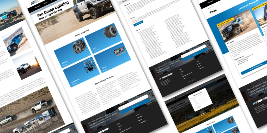
Transamerican Auto Parts
A diverse company with several out-of-date websites looking for a custom template to use across all brands.
Image Multi Caption
Custom Block
Type in /Caption and select Image Multi Caption.
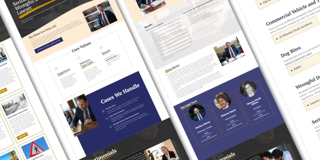
Small Text Here
Some short description about what we were able to accomplish for this client.
Here is something a bit longer-winded. It’s really cool when it does this and that. But it’s even better when sometimes you place some text in this section right over here even though it might get a little lengthy.
Portfolio Pieces
Custom Block
Type in /Portfolio and select Portfolio Pieces. You can select as many Portfolio Pieces as you’d like.


AutoZone
AutoZone came to us needing a new blog site built quickly that would allow for updates overtime.
Cync Health
Cync Health was in the process of building out their website and found that they needed helping bringing it over the finish line.

Elite Outdoor Lighting
A growing business with big ideas for their digital marketing strategy

Evangel University
Evangel was looking for a long-term partner who could grow with them as they used their website more-and-more as a tool for growth.

Lighten Group
Lighten Group is a threefold team of writers, media specialists, and speakers that creates written blogs, videos, and podcasts.

Slab Dream Lab
Slab Dream Lab’s products allow kids and adults to build and imagine with the largest, strongest baseplate system for Lego®.
Form Styling
Blog Post
Core Styles
These are not reusable blocks. This just shows the default styling for all content across the board. Anything that requires a CSS class will be noted.
Headings
Header 1
Header 2
Header 3
Header 4
Header 5
Header 6
ccc-alt
Header 1
Header 2
Header 3
Header 4
Header 5
Header 6
Content
Lorem ipsum dolor sit amet, consectetur adipiscing elit. Duis tristique lacus eu nunc iaculis aliquet. Sed at aliquet urna. Maecenas nec felis dictum felis sodales porttitor. Sed sit amet feugiat libero, eget vehicula justo. Suspendisse at feugiat sem. Nulla molestie laoreet augue sit amet viverra. Curabitur tortor eros, mattis ultrices orci condimentum, efficitur commodo augue. Mauris sed justo pulvinar, condimentum magna nec, bibendum massa. Cras mattis ultricies metus et sodales. Nulla commodo est eget ante consectetur molestie. Morbi vel vehicula mauris, ac luctus nibh.
Aenean odio quam, lacinia quis purus vel, facilisis pretium nibh. Phasellus a nulla auctor, accumsan ligula at, viverra odio. In ut ipsum risus. Donec porta maximus diam, ac rutrum orci hendrerit id. Class aptent taciti sociosqu ad litora torquent per conubia nostra, per inceptos himenaeos. Nullam vitae vestibulum nulla. Cras rhoncus consequat pretium. Nam nisi arcu, bibendum sed metus in, finibus consectetur libero. Aenean purus velit, euismod ac justo nec, tempus consequat augue. Phasellus bibendum lacus at consectetur elementum. Cras id magna at lectus placerat laoreet. Phasellus a lacus posuere, gravida urna sed, imperdiet tellus.
- Vestibulum cursus volutpat lorem
- Vitae iaculis justo luctus sed. Sed eu ligula ligula.
- Cras convallis quam ac sem condimentum
- Pharetra rutrum dolor sodales.
Phasellus sapien augue, tincidunt quis pharetra non, mattis eget ligula. Pellentesque volutpat orci felis, fermentum gravida mauris viverra sed. Donec vitae erat non neque blandit interdum. Phasellus ac nunc lorem. Ut vestibulum quam eu metus aliquam, nec tristique turpis faucibus. Aenean volutpat accumsan metus at efficitur. Integer justo nibh, laoreet vitae vehicula sit amet, feugiat in ante. Phasellus venenatis, nibh in congue ultrices, ante enim vulputate leo, ut convallis felis ligula vel elit. Etiam laoreet nibh vitae risus accumsan lacinia ac ut lacus. Pellentesque habitant morbi tristique senectus et netus et malesuada fames ac turpis egestas. Ut mollis est non rhoncus eleifend.
Buttons
As the text inside of each button, I have written out the CSS class to apply at the Button level to make the size correct. Each button, I have used a different background and text color.
Ninja Forms
Create Forms on the backend of WordPress. (Left Sidebar)
Add Ninja Form by typing /Ninja and click on Ninja Forms. Then chose which form you want to display from the dropdown menu. Add ccc-hide-title to the Ninja Form block to hide the title and “dashed” line on the side (aka. make it look simpler)
Quote
Core Gutenberg Block
You can add one of the following three CSS classes to change the color of the arrow:
- is-primary (default/unnecessary)
- is-gray
- is-white
This Is a Quote Block.
Here is where you would write the caption


